The rise of data visualization in finance has ended the days of PowerPoint eye(sore) charts. It’s also brought a new level of performance to the FP&A organization within companies. You’re probably familiar with the tried-and-true saying “a picture is worth a thousand words,” which is simply another way to say, “seeing is believing.”
What if the picture was real data that could lead to impactful, actionable insight?
What is data visualization? According to Sisense, it’s the creation of visual representations of data that clearly communicate insights through charts and graphs. These charts and graphs help leaders and decision-makers make better, data-based decisions more quickly than the traditional data table. And it keeps them from getting lost in a Where’s Waldo-style puzzle maze of stats and datapoints.
Time is money – and so is information. Spending hours upon hours digging through the data in traditional formats is a thing of the past. Utilizing data visualization practices, organizations can leverage their data to improve all aspects of their business. There are several advantages of these new data visualization techniques over the traditional reporting methods:
Data visualization makes it easier to interpret your finance data.
Most people are visual learners. As such, most of the world naturally prefers visualizations of concepts and new information.
Traditional reporting methodologies typically present static data points – and place the burden of interpretation on the analyst and even the reader. Charts and graphs allow users to see context surrounding data you’re trying to convey through your visualization. This can help remove subjective interpretation, which can be risky in data-based decision-making.
Data visualization allows for quick interpretation of results (the way you intended).
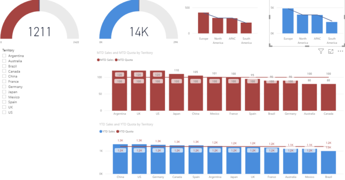
In this example, a sales manager can quickly identify how each of their territories are performing in relation to goals:

Clearly, Europe is leading the pack and outpacing their goal (line trend). And South America has some catching up to do. In a traditional report with static data points, the manager could take more time to arrive at this conclusion. The time can instead be invested in developing solutions, rather than analysis.
You can interpret large quantities of data more efficiently.
Along with the speed of interpretation, a manager can now take larger quantities of data, see the bigger picture more clearly and build concise reporting. Visualization tools utilize filtering properties to allow the manager to dig into the data more proficiently.
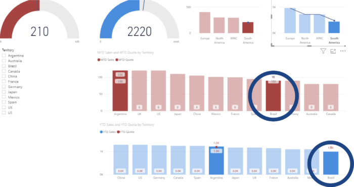
In our example, the manager can click on South America to reveal charts detailing what contributes to lagging performance.
When the manager drills down, s/he can see Brazil is the reason South America is missing month-to-date and year-to-date goals.
With the traditional model, this manager would have to dig through each of the data points. He’d also waste considerable time manually calculating or analyzing numbers to determine the source of the problem.
Data visualization in finance helps reveal patterns and anomalies.
Trending data is easier to see in a chart or graph in monthly reports of static data points. In the example above, the manager can click on Brazil to pop up their monthly performance for the year. Digging deeper, they can even see what products are contributing to the miss over time. Visual patterns empower the manager to make better decisions and learn drivers of problems. Does Brazil just not purchase one certain product? Is there a competitor in Brazil that is outpacing us? All of these insights can be captured through trending information easily visualized in charts.
These advantages of data visualization provide businesses a true competitive edge – especially in today’s data-filled world. And the potential growth and operating efficiency that can be mined quickly cover the initial costs of implementing visualization tools. From Spreadsheet Server to Tableau to Power BI, there are a lot of tools to choose from. Good news is 8020 Consulting can partner with you to find and customize a solution that’s best for your organization. Contact us to see how we can help.
Want to learn more about planning? Download our free timeline:
